Hi Everybody! How was your weekend? A trip to the pumpkin patch and our lazy Sunday were very rejuvenating. I'm now ready to tackle my to do list for the week. That got me thinking about beautiful places to work creatively.
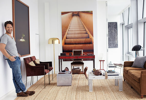
I have done posts in the past about workspaces, but this one can really stand on its own. You have probably seen offices by Nate Berkus before, but have you seen this one? It was new to me and talk about intriguing! Wow.
 |
| via |
What do you think of it?

21 comments:
It's the layout that really 'speaks' to me - so open and bright!
Definitely a "feel good" space....love how bright and inviting it feels.. a happy space!
Glad you made it out to the pumpkin patch - all our pumpkins are from the corner grocery store. Nate has such a knack for adding just the right amount of the unexpected to an otherwise classical space, and this office is no exception.
Happy Monday! XO
Love the art on the wall - it's so unexpected and we wonder if it motivates Nate to keep moving up!
xxoo
C + C
P.S. Never made it to the pumpkin patch but did have a relaxing weekend, nonetheless.
I love Nate's work, but Im not sure I would get any work done here. I think I would be looking at the image all day wondering where it goes.
Love him, love everything he does!
Stacy
I was just thinking what Taylor already said! Too funny,.,..love everything Nate does...
I could work there and be perfectly content! Love it!
I love the print of the escalator behind the desk. It adds such drama and depth to the space. I love the pair of lean chairs in a beautiful plum color and, of course, I love the light from those floor to ceiling windows.
Best...Victoria
Nate is so cool and seems to intuitively know how to juxtapose different elements to pull together a balanced space. I love the use of the wall art...I think it actually makes the room.
xoxo Elizabeth
I think it's amazing..love the pair of chairs!!
That would certainly keep you brainstorming! I love how clean and uncluttered it is. How does he keep it that way?
-Lane
I love it! Love every single piece of furniture and the art..so chic! And the natural light..just wow!! xx meenal
Nate is just as nice as that office is. I love how he combined a variety of elements and that it is bright and light.
pve
Love the artwork, especially the escalator steps. (And the look.) However, I think I would want the seating group pulled closer together. The sofa and chairs are some distance apart. Too far apart for comfortable conversation in a meeting.
Cheers,
John
That escalator steps is simply amazing, its effect gives the interior an expanded room view.
Nate Berkus has a good taste. I first saw him on TV with Oprah.
What a design! I love it. Thanks for sharing.
Nate Berkus is really good when it comes to designing worskpaces. Thanks for sharing.
That artwork is just beautiful, even the chairs and sofa. Thanks for sharing this post.
That is really a creative office space, but I agree with Taylor, I won't get much work done there, hahah, I would be just starring with my jaw dropped ;)
Post a Comment