Tuesday, May 31, 2011

Equestrian Essence

Lately it seems like I have been seeing a lot more equestrian-inspired art in design. Normally that wouldn't really be my thing, but in these settings, I really like the look.  Check it out:


via Velvet Moss

House Beautiful
via Lime in the Coconut
via Sanity Fair

What do you think of this look?

Monday, May 30, 2011

So Cool In Copenhagen...

My husband and I just booked our flights for a trip to Copenhagen and then on to a wedding in Norway for early August.  I have been searching for a hotel in Copenhagen for a while now and couldn't find the right one, until now...  Last night I came across these three (related) boutique hotels in this design-driven city.  We are going to stay at the Bertrams Hotel and I can't wait to check it out!  They have hints of the clean Danish design that we are all familiar with, but also heavy influences from Balinese design, which I love. 

I had a hard time deciding since all three were so impressive, so I thought I'd share a little taste of all three for some inspiration:


Cool, eh?

Saturday, May 28, 2011

In Love With Succulents...

Does anyone else out there love the sophisticated look of succulents in interiors?  I think it's so much more interesting than the typical house plant.  Maybe it's because I like low maintenance plants, but more and more often I love the look of succulents in design settings.  Take a look at these great examples:

I love the organic feel of this table display - especially
when they are in those rough containers.

I always fall for an urn, especially when the image gives a new use for one! 
You can read more about urns here.

{via Decorology}
 Wow, what an awesome industrial-feeling table!  I love how the succulent
gets a modern look when put in this fresh white vase.

{via Providence Ltd.}
What a cute idea!  Pick up some vintage silver chamapagne glasses
and some small succulents - instant sparkle and earthiness combined.

{The Zhush}
What a great contrast here against the wood, silver and ethnic feel of the ikat. 
Very cool combo.

OK so I am reposting a picture I already used when I wrote about Kitchen Kick Starts,
but I couldn't resist.  I think a low, wide bowl filled with
succulents on a kitchen counter looks just great.


Friday, May 27, 2011

It's All In The Details

Today I'm excited to be guest posting over at RocoRennie, as a part of Rachael's series "It's all in the details".  It's such a fun series, dedicated to what inspires us the most in our homes.


Head over to her blog to see what inspires me, and to get to know her blog if you don't already.  I love her refreshing, creative ideas and images and I think you will too. Thanks so much, Rachael, for including me! 

Thursday, May 26, 2011

In the Garten...

No, that isn't a typo.  :)  Earlier this week we went to the Munich's largerst city park, the Englischer Garten (English Garden).  It has several beautiful beer gardens scattered amongst the natural, spacious grounds.  My favorite place is set on a lake within the park, called Seehaus.  Here are a few pretty shots to enjoy. 

By the way, I promise to get back to more design-related posts soon - with visitors this has been more top of mind but I'll be back on track this weekend!

Photography by Barbara Jordan Dettweiler

Photography by Barbara Jordan Dettweiler

Tuesday, May 24, 2011

Jill Rosenwald

I have been in love with these beautiful trays (among other pretties!) made by Jill Rosenwald for a while now.  I have posted a couple of times about how much I love to use trays in design here and here so of course they totally drew me in.  Her designs are so nice I don't think I would want to cover them with accessories in a tablescape!  However, I would certainly use for a catch all tray for keys, etc. so I could enjoy their beauty every day, or on display on a bookshelf. I love their earthy, yet sophisticated, style...


Which one would you choose, and how would you use it?

Monday, May 23, 2011

Books, Books Everywhere!

Hi Everyone!  Sorry I have been MIA for a few days.  My sister is visiting from the US so we have been out and about enjoying Munich and beyond! 

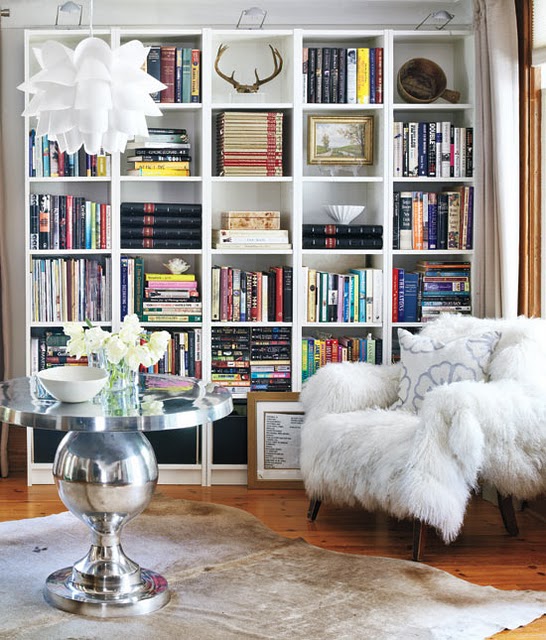
I'll be back in full swing this weeked but until then here are some ideas for using books in all styles of spaces.  We all know how personal and beautiful a space can be when it is filled with books but I continue to be amazed at how versatile they can be.  No matter what your design style is or what type of space it is, books just plain "work".

Here are a few rooms that make this point beautifully for some new inspiration, spanning a variety of styles:

{via Velvet Moss Blog}
 Bohemian...

{Courtney Giles}
Upstate Chic...

Sophisticated Santa Barbara...

Ethnic...

European...

Simple...

Coastal...

Feminine...

Eccentric Intellectual...

{via Enchanted Home Blog}
San Franciscan...

Casual...

{Elaine Griffith}
Classic...
Mid-Century Modern...

and Traditional.

I'm sure there is more but these are a few examples to start with!
What is your favorite way to use books in a space?

If you'd like to see more about decorating with books, look here, here, and here
I also posted about reading nooks - you can find that here.

Friday, May 20, 2011

Casamidy

A little while back I came across Casamidy, a creative artisan resource out of Mexico.  Their work is very unique, and I'd love to buy a great statement piece for myself or a client.  Check out these examples, plus many more on their site!


Any favorite designs?
 

Thursday, May 19, 2011

Designer Envy: Steven Gambrel

I have a few photos in my files of a room I love that Maureen over at Eclectic Revisited posted a little while ago- she reminded me how much I admire the work of Designer Steven Gambrel of S.R. Gambrel Inc.  Take a look to see what I mean...he has some very creative ideas!

This room has a lot going on, maybe too much for my taste. However, it's very interesting and packed with great ideas!  The parsons chairs, the throw, the framed, off-center botanicals, the round and rectangular tables to add interest, and more...

I love this look with chairs on both sides.  A gorgeous table and a pair of chairs
in yummy velvet = masculine and feminine at the same time.

A bit Belgian and very soothing!

The room that started it all, that Maureen and I both admire!

How could a traveler not appreciate a room with wallpaper like this??!

What do you think?  Are his rooms too neutral for your taste or just right?

LinkWithin

Related Posts Plugin for WordPress, Blogger...