******************************************************************************************************
Good morning! I was so excited that Barbara asked me to be her guest for this wonderful new series, entitled Design in Five. Its all about five things I would want to start with, for a blank canvas, a room with absolutely nothing in it. Furniture is a given but what else makes a room warm, inviting, what gives it character and a room that feels welcoming and like "home" to me? What are five things that would be must haves......well, I thought about this and it didn't take long for me to come up with my five. These are all time proven classics, that for me just make a room. The rest is just the icing on the cake. So lets begin shall we......
1. RUGS. preferably an antique rug or a rug meant to look antique, I like a worn in look, that slightly aged patina, colors that are a little faded. The good news is that if an antique rug is not in your budget, there are so many rugs being produced today meant to look old and distressed that fit nearly every budget so you can essentially get this look for far less than say a few decades go. At last, its all about the savvy and budget minded consumer and not having to compromise on great design and style. So first a few on the "high end" that are real Persian antique rugs, down to a few replicas, and to me, in the right space with all the right "fixins", any of these rugs could do the trick!
Now all of these below are under $1100.00 some around 700 and 800!!!!!!!
2. BLUE AND WHITE. One of my most favorite decorating elements!! I think there are basically no interiors where blue and white does not work and once again thanks to a vast and highly competitive global marketplace, there is the high end of blue and white but the low end is plentiful as well, I have known some to get phenomenal deals on Ebay, Overstock,etc....so here are some pieces that I think add instant pizazz to a console, table, side chest, kitchen island or buffet. To me, this is a must have in several rooms in my own home. It just adds instant elegance to a room, I like it in a grouping of various sizes and shapes. It really is a relatively inexpensive way to create an "expensive" look.
I like a grouping of sizes WS Home
Williams Sonoma Home is a good resource of pretty ones in all shapes and sizes
One word....SWOON!
This is 15.00 from Pier One!
Stunning..a pair of antique large Ginger jars
Look how beautiful these blue and whites look in this otherwise neutral tonal room!
And to me the height of elegance is a huge white orchid plant in a blue and white bowl...fabulous!
3. ART. Once again, this can be found in everywhere from art galleries, to flea markets, consignment shops, garage sales and online sites. I love groupings and gallery walls. I think its not so important necessarily to have a really important piece of art, but more to make it an interesting piece of art. If you are doing a grouping, try to stay with the same theme, if you are doing florals or botanicals, then work around that, ditto landscapes, still life, etc...whatever you are doing. Also often with less expensive art, you will likely not love the frame (if you do then you that's a big bonus) but changing out a frame is not a big deal and its amazing how it can transform a piece of art or a painting. So do not let a frame deter you. I really love antique mirrored frames. I also like mixing up a gallery wall with brackets to hold a plate or other decorative object to create an interesting wall. The reflection gives the room an elegant bling, and allows a little light and reflection as well. Some pretty examples below.....


This is so interesting, love all the different sizes, makes for such an interesting wall!
Everything here is done in gold leaf, makes it feel cohesive
Love this, its all the same theme, but like the different sizes equally matched on both sizes

4. SOMETHING FROM NATURE. The beauty here is you can literally walk outside and pick it up! I kid you not, I have done this many times, walked outside, gathered up pine cones, a huge basket of fall leaves, big tall branches, acorns, obviously flowers, etc.......you are only limited by your imagination! Nothing softens a room and creates interest like an element of nature. It works every time and you can vary the look with the seasons. A big vase of hydrangeas in the summer, an over sized bowl of pine cones in the fall, tall branches on a center table in the winter, etc.......some pretty examples below, something we can all do today!
Add a little greenery and pine cones to your chandelier!
Something as simple as fruit in an urn is so simple but so beautiful

Love the look of greenery from outside with pinecones atop a chest or armoire....beautiful!
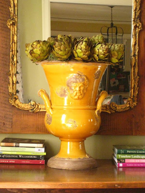
Everyone can afford a bushel of artichokes, lemons, green apples or limes...they look stunning in an urn or large bowl on a console, mantle or coffee table!
Try it....you will love it!
5. HURRICANES. I am big on soft lighting. OK, call me vain, I hate bright overhead lighting and the
I like over sized hurricanes, the more substantial the better in my book, they give importance when on a larger scale and anchor a space or whatever they are resting on, whether it be a console, coffee table, mantle, whatever. A few I like below and how I like to use them....

Mercury glass is quite pretty especially around the holidays
Love using them outside as much as I do indoors!
So there you have it...my five essentials to start building a beautiful room. Granted, you need much more but these are certainly great starting points. Again, in today's marketplace, there is literally something for every price point which makes stylish living available to every budget. It is all about using those resources, knowing how to cleverly put it all together combined with using a little imagination.
Hope i have given you some ideas or inspirations. This was a fun exercise and got me thinking too! Thank you Barbara for having me!
********************************************************************************************************
What great ideas! A white orchid in a blue and white ginger jar is such a classic, beautiful look and what a great suggestion to add something to a gallery wall to mix it up a little. I also love hurricanes and especially mercury glass...all of her suggestions struck a cord with me.
Thanks again so much Tina!


29 comments:
Tina's taste is impeccable. I am loving all of her choices and those photos of art so perfectly displayed have me swooning big time!! Great guest post. xo
I really enjoyed this post. Tina's taste is incredible and I love every single thing she has ever posted about. I really enjoyed her five things too, some great ideas that most of us can easily do.
Thank you and nice to discover your blog!
Barbara, this is a fantastic guest post! Tina has impeccable taste, and she's done a wonderful job describing her five chosen elements.
I'm so happy to find your blog, and I'll definitely be following from now on!
~ Wendi ~
I have come to rely on Tina for putting together great advice in the form of decorating choices for our homes. It has been fascinating to watch her build her dream home and she has been sharing how she makes her picks along the way. Nice topic for a post Barbara!
yes, Tina has wonderful tastes and one of these days I would love to check out her beautiful furniture store Safaviah...it's no wonder she love rugs and such as her store is well known for carrying quite a selection..
best,
maureen
You always have impeccable taste Tina in everything and this was no different. Love antique carpets but the ones I like are always out of my reach. Fun post and so glad Barbara invited you over, love thei series!
I can't wait to see Tina's new home decorated. She has the most exquisite taste and I know her home will be fabulous. Great interview!
Tina has great taste and I'll be interested to see her house and how she incorporates all these lovely elements once she's done... I love hurricanes, too, as everything looks better in candlelight!
xxoo
What a fun series -- and Tina is the perfect person to kick it off! I heartily agree with everyone of her five -- especially blue and white, which I'm slightly obsessed with!
Tina has fabulous taste! These images are stunning, as always. Always know that I will find beauty on her blog.
Teresa
xoxo
Wonderful post, love the idea of bringing something out from the outdoors, makes me want to go out to my yard right now and gather leaves, acorns and branches.
Great tips...no doubt that will make up one beautiful room. Love her take on things.
Glad to discover your blog as well.
Brilliant suggestions and images from Tina... I loved reading this and what a fantastic series... Can't wait to read more Barbara... xv
gorgeous... tina does it again! i think she should have her own tv show... i'm a big fan...
and i love your blog... simply wonderful...xx pam
Barbara thank you so much for featuring Tina.
She has such excellent taste. I was so pleased to see Art amongst her List of Five!
xoxo
Karena
Art by Karena
What a fabulous post! Everything is beautiful, but my fave is the blue and white. Such lovely images!! Incredible job, Tina!
Tina has lovely taste. I got to thinking that I have hurricane lamps in almost every room!
Beautiful inspiration. Love those rugs.
You definitely gave me some inspiration Tina! Lovely post!
Stacy
Ooops...that's me above. Posted under my son's acct by accident. You'll probably see me as "Bobby" a lot now that he has a google acct!!!
Stacy
Tina has wonderful taste. I would choose everything she did. The rugs are amazing.
Wonderful post!
I really enjoyed reading about your 5 essentials...I completely agree! I really liked that you had some different elements than what most people automatically come up with!
Man, you're good, Tina! These are all great ways to make a room feel like home. I need to incorporate hurricanes into more rooms in my house.
Love every single thing, I need more blue and white and more of the outdoors in. You are right, things are much more affordable than ever even things like rugs that were once very expensive. I love all these ideas and the hurricanes is a really good idea, I will looking for them right away.
Thanks for all the wonderful ideas. Nice to discover Haus Design too!
Tina could decorate my house while I'm away & I would return happy with all of her selections! Absolutely beautiful and informative post. I'm bookmarking this one; I'll need to soak it in little bits at a time!
-Keri
Lovely post, Tina. Your ideas are great and as always, your post is packed full of visual delight. x Sharon
I so agree with Tina regarding soft lighting. Some spaces make me want to run, not walk to the nearest exit.
Lighting has a very strong emotional impact on us. Of course people react differently to light, or lack of it. My sons usually want it full blast and I just don't like the glare.
What a fabulous post! This shows why so many of us gravitate to Tina and her her spectacular taste and style!!
I noticed you used many photos from Nell Hill's in Atchison, Kansas. She has a shop in North Kansas City that is fabulous.She should get credit. Many were from her home.
Post a Comment