

Great detailing on the inside of that shade!


I love it when the vignette is layered in front of artwork...


Another great use of art...in front of the shelves!


Love those brass knobs!


What's your best tip for styling a great vignette?


14 comments:
I don't go in and try to style a vignette all at once. My shelves and table tops just happen by placing one thing at a time over time. I usually end up moving stuff anyway but this was great fun to see and learn.
XX
Debra~
Barbara-
Where do you find these images. Stunning. You can bet I am pinning away!
Happy Friday.
Teresa
xoxo
Lots of great inspiration here! I think the most important thing is to make sure you're styling with things that you truly love, that make you happy. That way, you make sure your vignette has "soul". Happy weekend, Barbara. Can't believe it's finally going to climb into the 90s! Stay cool. XO
These are some fabulous vignettes...our favorite thing to do. The icing on the cake in any design. I agree that they should be personal to the client...but sometimes it just takes that unusual piece..that you can find for them, or you need to add texture or height to the things that they already have. The most important thing is the editing...Just because you own something doesn't mean you have to use it. Have a great weekend. Mona
i like the unexpected in a vignette. so much inspiration here, and i love the closeups because sometimes the really special stuff is small and gets missed!
i have a small alligator head on an old stack of prayer books right now. from a distance, you would think OH ISN'T THAT SWEET? but up close, LOOK AT THOSE TEETH!
ok. maybe not the best example.
smiles, B.
michele
Gorgeous vignettes! Yes, I too wonder where you find all these images. A post like this doesn't happen in 15 minutes.
Personally, I like clean and simple. Accessories are the icing on the cake. But as with frosting, too much of a good thing will make the cake too sweet. Careful editing. Too much - everything fights for attention - the design begins to fall apart. Rotate to keep the space interesting. Don't feel you have to fill everything up all at once. Let things evolve.
Cheers,
John
Such a great post Barbara...sometimes when I am befuddled (alot) it is great to have something to refer to...wonderful ideas
Such effortless style in all of these images. Love the table with the basket below and the throw casually draped off of the edge...beautiful. Happy weekend ~
Some great notions here. I like to have something "living" and things that I love and maybe collected in my travels. Shells, interesting stones or art pieces that I've carried home from a trip alway make vignettes more interesting to me...
Great examples, Barbara. I love Heather Bullard's kitchen shelves. Creating vignettes is my favorite part of designing a space. I especially enjoy "shopping" in someone's home to create a vignette using their own things in new and different ways. Many years ago, my job involved creating shop and window displays for retail stores. It was so much fun for me, I almost would have done it for free...almost.
Best...Victoria
What great inspiration here. It makes me want to clear all my surfaces and start all over again! Hope you are well x Sharon
Lots of great styling ideas! My "Styling" pinterest board is going to be happy with some new additions.
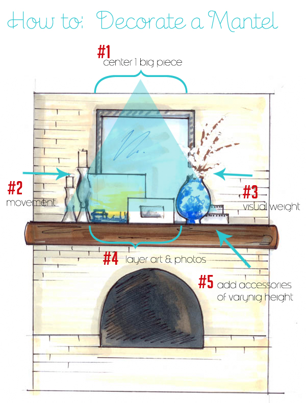
Just pinned so much of this! I love the diagram--it's great to have these to show clients when they want reasons for why you make a certain choice. Thanks again!
-Lane
sheet pan rack is important in every kitchen. Because through this we can arrange our kitchen equipment like plats, glasses easily. It will take a little space and our kitchen will look cleaner. Work smartly nor hardly.
Post a Comment