Happy Monday to you all! We had a nice weekend with our family visitors and a lot of R&R...however, the house projects continue around the visitors. :)
As many of you know we recently moved into our new house. My husband keeps reminding me, as my house to-do list keeps seems endless, that I said I loved this house when we looked at it. Well, I do, but...well, you know how it goes. :) I think unless/until we build our dream house I will never settle down on wanting to change/enhance/beautify things around the house, and perhaps not even then!
Anyway, one of my latest projects was to change the wall color in our powder room. The guest powder room is small and windowless, but I am OK with that. The big challenge was that the walls are not in perfect condition. I am not sure what the history is there but they need a lot of hard labor to make them perfect again...and that won't be happening anytime soon!
That meant making the most of it for the time being. I would have loved to go with a bold wallpaper or grass cloth such as the powder rooms below, but given the texture of the walls that would have been a major undertaking. Check back for a blog post on that in a few years!
 |
| bhg.com |
So of course that led me to paint. I was debating on lightening it up with a bright color, but in the end I went with a dark color. The dark color hid the imperfections and gave it a cozy, moody feel whereas the light paint showed up all of the flaws with no forgiveness.
The paint I went with is called Cracked Pepper from Behr and I'm so crazy about it I wanted to share it all with you:
I don't know if your computer will do the color justice. I was going for a dark charcoal, which it sort of is, but it also has a deep blue hue to it that - although unexpected - is absolutely gorgeous. It came with primer already built in, so I only needed one coat! To me, that was huge since I tend to lose steam after the excitement of the first coat.
Here's a collage of two angles of our bathroom. The picture doesn't look like it, but the new wall color blends well with the (already-there-when-we-moved-in) granite counters, too. (Please ignore the very odd looking orchids that I didn't arrange better before the photo!)
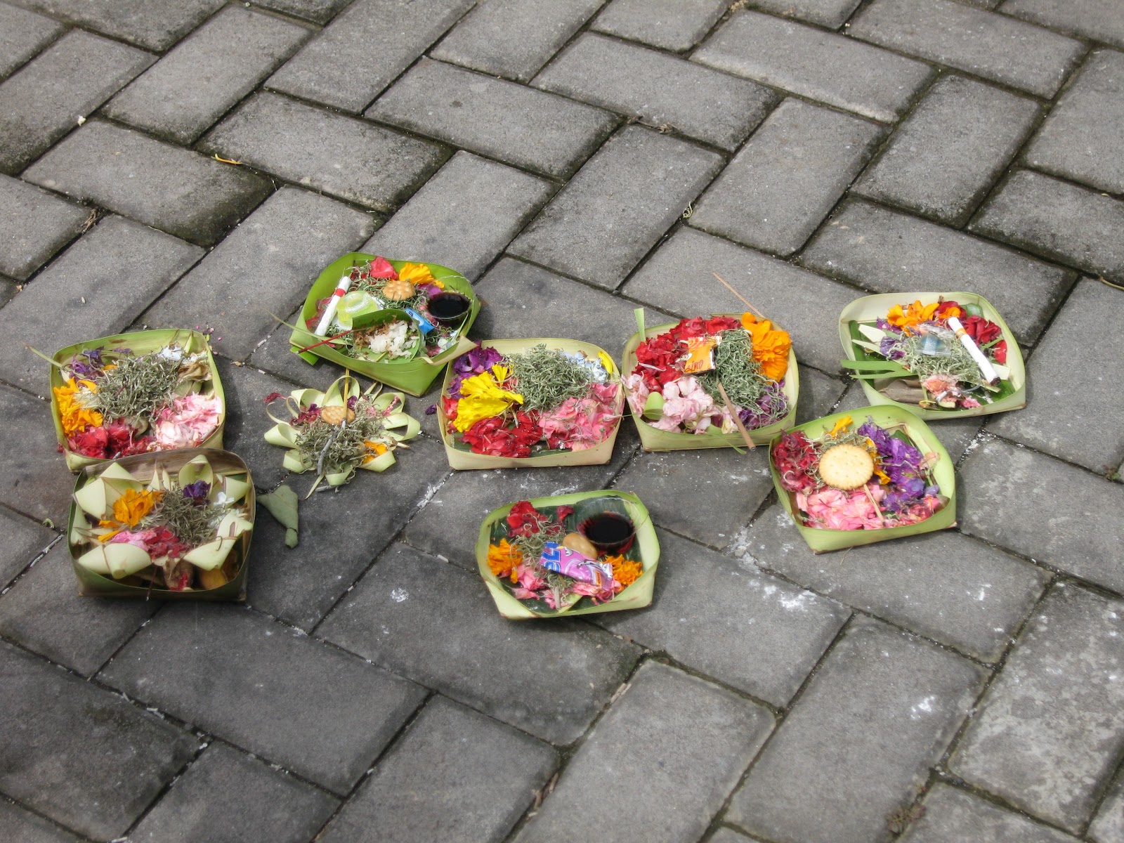
It ended up having a very Asian vibe - the soap holder was purchased in Bangkok on our honeymoon, the wooden sculpture was found in Singapore on a business trip years ago, and the photo was taken on our recent trip to Bali. Who knew all of these things would come together in one small spot? I'm sure I'll change it out regularly, but that's how it's going to start.
What an improvement over the odd pumpkin color that was there before. I love pumpkin/orange in decor, but in this space it was all wrong. Anyway, I just wanted to share that with you all because I'm crazy about it!
By the way, for those of you that read my privacy post a while back, this picture (as well as the one I posted here) is the kind of snippet I was thinking about.
Hope that works for you wonderful readers!






 A stunning temple set on this cliff.


